Wednesday, 29 January 2014
ConorDrury 7200 - Ancillary Draft 3
I decided to lighten the colour of my spines of my Digipak, this matched the rest of the album better than before. To finish these i'll include the "Ill Systems" logo we created earlier in the project.
Conor Drury 7200 - Ancillary Draft 2
I decided to change the picture I used for my lyrics sheet to something more plain which allowed my lyrics to be more easily seen. I still stuck to my house style but decided not to include red as it made the whole thing feel more cluttered, now I have to change the spines to make them look more aesthetically pleasing.
Friday, 24 January 2014
ConorDrury 7200 - Ancillary Draft
I still need to change the font sizes and placement of the lyrics. I also need to edit the spine to make it more aesthetically pleasing as I feel its rather plain and "GCSE" standard at the moment.
Monday, 13 January 2014
ConorDrury 7200 - Digipak Planning
My initial idea was to focus on creating my album using 3d elements, I would do this by layering slightly transparent red typography over blue. This would create a retro original feel to the album cover whilst also linking it to the indie genre.
I created some trial outcomes using this style but felt it wouldn't match the overall sad feel of the music video we created.
For my next Drafts I have decided to focus on using black and white. Again this will link to the retro style of the indie genre and also to other album covers of similar artists such as Ed Sheeran's series of artworks for his single releases.
To push the boundaries of my Digipak I have decided to include A subtle use of slightly transparent red, as well as looking aesthetically pleasing the fading red could symbolise the love he has lost which resulted in him writing his this album.
Monday, 6 January 2014
Molly Rickards (7111) - Digipak Plan
On each of the panels there will be an image of the artist or guitar, this ensures the look of the artist is known. On the back of the digipak I will include a list of the song titles and a layered image possibly including a shot from the music video to create a link between the video, song and case. Each of the images will be different I will add a subtle sepia filter to create the right colour and I will use the same font we used as the title on the music video, again to create the link.
I want the whole pack to have a theme and I don't want it to look to busy, when I have put the photographs together I will see how well it works and I will look at how I can create a more abstract effect if needed.
I may also consider including some website addresses to promote the singers websites or some information about the new artist.
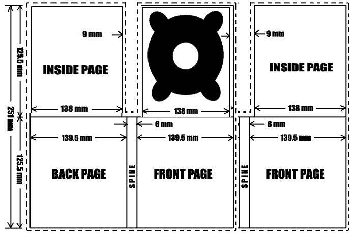
Molly Rickards(7111) - Digipak plan of layout
In many digipaks a small booklet is included containing lyrics to the songs on the album, this will be something I might include as it will also help to promote the songs of this new artist and will give me more opportunity to promote the look of the new artist in the digipak.
I will use a picture of my artist on the front of the case, along with his name and the name of the album.
On the back of the case I will put a list of the songs on the CD and another photograph, possibly of his guitar to help portray the genre of these songs. I will use quite a muted colour code on the digipak, such as greens and browns similar to the colours we used in the music video.

Subscribe to:
Comments (Atom)


